Advanced Liquidity Trap & Squeeze Detector [MazzaropiYoussef]DESCRIPTION:
The "Advanced Liquidity Trap & Squeeze Detector" is designed to identify potential liquidity traps, short and long squeezes, and market manipulation based on open interest, funding rates, and aggressive order flow.
KEY FEATURES:
- **Relative Open Interest Normalization**: Avoids scale discrepancies across different timeframes.
- **Liquidity Trap Detection**: Identifies potential bull and bear traps based on open interest and funding imbalances.
- **Squeeze Identification**: Highlights conditions where aggressive buyers or sellers are trapped before a reversal.
- **Volume Surge Confirmation**: Alerts when abnormal volume activity supports liquidity events.
- **Customizable Parameters**: Adjust thresholds to fine-tune detection sensitivity.
HOW IT WORKS:
- **Long Squeeze**: Triggered when relative open interest is high, funding is negative, and aggressive selling occurs.
- **Short Squeeze**: Triggered when relative open interest is high, funding is positive, and aggressive buying occurs.
- **Bull Trap**: Triggered when relative open interest is high, funding is positive, and price crosses above the trend line but fails.
- **Bear Trap**: Triggered when relative open interest is high, funding is negative, and price crosses below the trend line but fails.
USAGE:
- This indicator is useful for traders looking to anticipate reversals and avoid being caught in market manipulation events.
- Works best in combination with order book analysis and volume profile tools.
- Can be applied to crypto, forex, and other leveraged markets.
**/
Search in scripts for "volume profile"

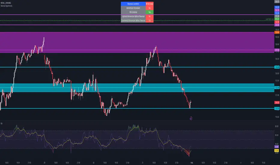
Reversal Opportunity📌 Indicator Description – Reversal Opportunity 🎯
🔍 General Overview
The Reversal Opportunity indicator is designed to identify ideal conditions for Reversal Trading, but it does not provide trade entry signals. Instead, it helps traders determine whether the market conditions are favorable for a potential reversal.
It is specifically designed for traders who execute Reversal trades (Long or Short) and want a clear indication of whether the market is currently suitable for such setups.
💡 What does this indicator do?
- Identifies strong momentum before a reversal (a sharp upward or downward move).
- Detects momentum slowdown (decreasing volume and smaller candles).
- Checks if the RSI is at an extreme level (above 70 or below 30), indicating potential overbought or oversold conditions.
- Displays a table at the top center of the screen with the following key data:
- Are the conditions for a reversal met?
- Is there a slowdown in momentum?
- Is RSI at an extreme level?
- Was there strong uptrend momentum before a possible Short Reversal?
- Was there strong downtrend momentum before a possible Long Reversal?
⚙️ How Does the Indicator Work?
The indicator displays a table in the center of the screen, updating every 5 candles to indicate whether the market conditions are ideal for a reversal trade.
📊 Main Status Row:
- ✔ Ideal Reversal Setup → Conditions for a reversal trade are met (not a trade recommendation).
- ✖ Not Ideal → Reversal conditions are not met; it may be better to wait.
📌 Key Criteria Displayed in the Table:
1. ⚠️ Momentum Slowdown
- Yes → Momentum is weakening (a good sign for reversal trades).
- No → The market is still moving strongly, and a reversal might not be ready yet.
2. 📈 RSI Extreme
- Yes → RSI is above 70 (overbought) or below 30 (oversold), indicating a potential reversal.
- No → RSI is still in a normal range, suggesting that waiting for further confirmation might be wise.
3. 📊 Uptrend Momentum Before Reversal
- Yes → There was a strong uptrend over multiple consecutive candles, potentially setting up for a Short Reversal.
- No → No strong upward momentum was detected, meaning conditions for a Short Reversal may not be ideal.
4. 📉 Downtrend Momentum Before Reversal
- Yes → There was a strong downtrend over multiple consecutive candles, potentially setting up for a Long Reversal.
- No → No strong downward momentum was detected, meaning conditions for a Long Reversal may not be ideal.
🛠️ How to Use the Indicator?
- If "✔ Ideal Reversal Setup" appears, there is a high probability of a market reversal – use your personal entry strategy for further confirmation.
- If Momentum Slowdown = Yes, RSI Extreme = Yes, and strong momentum occurred beforehand, this is an ideal setup for a reversal trade.
- If any conditions are missing ("No"), it may be better to wait for further confirmation instead of entering too early.
- The indicator does NOT provide trade entries! Use your existing trading system for confirmation before entering a trade.
👥 Who Is This Indicator For?
- Reversal traders (entering against the current trend after a strong move).
- Intraday traders looking for reversal trades at extreme market levels.
- Technical traders who rely on Price Action and Volume for trade setups.
⚠️ Disclaimer:
This indicator does not recommend trade entries but provides insight into market conditions. The trader is responsible for risk management and decision-making.
It is best used in combination with additional confirmations such as reversal candles, Order Flow, Bookmap, or Volume Profile to improve accuracy.
🚀 The indicator is ready to use – add it to TradingView and get instant feedback on whether the market is ideal for a Reversal trade!
G.O.A.T. Scalper Diagnostics v1OVERVIEW:
The G.O.A.T. Scalper Diagnostics indicator system enables users to discover unorthodox indicator patterns, reading price charts in unusual ways, thus gaining an edge over the majority of market participants they trade against.
CONCEPTS:
Th G.O.A.T. Scalper Diagnostics is a system that aims to satisfy the fundamental condition for successful online trading - providing an edge.
It's a battle between advantages. To take other people's money, successful traders must have an advantage over everybody else. To hope for consistent success in trading, you need to do things differently and see what almost nobody else sees. Of course then you must act on it, and that's where the G.O.A.T. Scalper Diagnostic's mandate ends.
I believe the vast majority of indicators out there show you what everybody else sees. I've always been an indicator guy, I respect and cherish most indicators and I know a good indicator when I see it.
However, although most indicators are great works of art, their practicality is in most cases doubtful. Presenting great information is one thing, but providing an edge over the people you trade against is something different.
What Everybody Else Sees
The G.O.A.T. Scalper Diagnostics is based on indicators most of you have probably heard of and used:
Moving Averages (particularly the Kaufman Moving Average, among others)
ADX and DI
Bollinger Bands
Stochastic (particularly the Stochastic RSI)
Most traders should be well familiar with these classic indicators, they've provided the basis for online indicator trading for decades. But it's also true that due to how popular online trading has become all over the world, one is more and more unable to use these indicators successfully on lower timeframes.
Usually, more noteworthy success is achieved by going up in scale and discovering the timeframe where a particular indicator produces no false signals. Often times these timeframes range from bi-weekly to multi-month scale. In other words, consistently successful low timeframe trading and scalp trading in particular are now almost impossible using indicators.
Traders that dominate the scalping arena are big professional/institutional groups of traders, who have systematic access to the order books of most exchanges. This can be achieved one way or another, but not by individuals, small groups without significant capital or simply traders who lack political/social power and influence in the trading field.
In other words - giant order book traders have an edge over everybody else, who use indicators to trade on lower timeframes.
Through a series of interventions into these classical indicators, the G.O.A.T. System brings them back into the lower timeframe competitive game. Most original formulas are preserved, but these immortal classics are applied in ways popular TA would consider unorthodox.
Ingenious Indicators Built by Creators
The G.O.A.T. Scalper Diagnostics relies on the fundamental work of others. The System is developed on the basis of:
Quadratic Kernel Regression - it uses the publicly published library of Justin Dehorty: www.tradingview.com
PMARP - Price Moving Average Ratio & Percentile, publicly published by "The_Caretaker": www.tradingview.com
These Creators deserve full credit for their fundamental work and are endorsed by the G.O.A.T. Scalper Diagnostics project.
And yet... ingenious and inspired as these tools are, in my humble opinion the general public is presented with a rather unproductive way to apply them. In my own view, these wonderful tools built by JDehorty and The_Caretaker have a massive potential should they be applied and wielded in a different direction. So I tried to bring my vision about them into flesh with the G.O.A.T. Diagnostics.
What the G.O.A.T. Scalper Diagnostics Is and How to Use It
It's a System for new pattern discovery, bringing the disciplines of pattern and indicator trading together.
By using it as a stand-alone, or mixing it with other great indicators, one is able to discover new indicator patterns. Patterns can be compared, matched together and categorized. By applying statistics to differentiated historical pattern groups, we're able to derive their meaning.
Thus, the trader is able to research their own "alphabet" to read the price charts. After categorizing and differentiating pattern groups with statistically predominant meaning, the trader is then able to read into longer scenarios - price set-ups that are harder to detect due to them being stretched in time or misshapen according to the particular situation.
The G.O.A.T. Scalper leverages and encourages group trading, as different traders will probably discover different price "alphabets" for themselves, potentially giving rise to a social economy of sharing and combining "trading languages" based on indicator patterns people have discovered via the G.O.A.T. Diagnostics.
Support/Resistance Trading
The G.O.A.T. Scalper has its own way of deriving Support/Resistance.
Unlike most existing S/R indicators, The Scalper derives Support/Resistance not by measuring price highs, lows and closes, but solely by using momentum and trend strength.
This seems like a much more versatile way to plot S/R during scalping on low timeframes where time is of essence and the trader's view is too narrow to have macro S/R levels in constant consideration.
The Scalper's way to derive S/R in real time and on the go, while staying very relative to important higher timeframe S/R zones, makes it much more desirable than any other S/R indicator I've thus far encountered.
All S/R functionality is derived from the classical ADX and DI indicator. To do this, I use the ADX and DI in an unpopular way. To generate the actual plot of S/R levels I also modify the indicator's code, not by removing functional parts from it, but adding more to it in order to filter the signals it produces.
I can metaphorically describe its action in the following way:
Imagine you're Price action itself;
You're walking through a labyrinth or corridors. You're walking through one straight corridor, and it has a crossing with another corridor ahead;
Very strong wind is blowing along that other corridor. You can't see the wind, but when you reach it and try to move past it, the force of the wind resists your moving ahead and instead pushes you sideways.
At this point, the G.O.A.T. Diagnostics already knows this can only be one thing - resistance.
Orthodox TA and trading demand retests. In my opinion, this deeply rooted tradition wastes time proving the obvious, then wastes time again double-proving the validity of recent past, while scalping opportunities go to waste. Modern successful traders are way ahead of the popular strategy of testing and retesting S/R that almost every trader uses. So-called "Stops hunting" is just one expression of this situation, where wide adoption of the S/R retesting strategy actually lures unsuccessful traders into the schemes of the successful few.
In my own way of trading, I use the G.O.A.T. Diagnostics to take action on Support/Resistance as it's plotted in real time.
But probably my biggest heresy into the DI is my opinion, that the crossings of the +DI and -DI are useless and should actually be discarded.
My research shows that the DIs often show indications of being "oversold", but don't seem to exhibit an "overbought" state. Statistically, I've had much more success basing my TA on that, rather than cross-ups and cross-downs of the DI plot lines.
Therefore I discarded these crossings by presenting the DI part of the ADX and DI as a Heatmap channel rather than crossing lines.
To further enhance the ability of the System to provide S/R analysis, I plot this Heatmap onto an adjustable price offset plots (a percentage above and below current price).
In modern times, the vast majority of trading is done by automatic machines and algorithms. To give a specific example, one can easily notice, that a 5% offset of the BTC 1h price plot leads to remarkably accurate S/R charting. Following the rule to chart a S/R line connecting highs and lows on the 5% price offset often successfully "foresees" valid S/R zones before price ever visits them. Or, the levels were visited so far back in the timeframe's history that orthodox understanding considers them "invalidated" or washed away in the noise of the relevant volume profile.
My explanation for this is simple - I think Grid bots now dominate automatic trading across the majority of exchanges.
In my understanding, by adjusting the percentage offset of current price action I can often discover relevant conglomerations of dominating Grid bot cell parameters and anticipate price reaction. By plotting the DI heatmap on these price action offsets I can use the indicator for my trading decisions.
Heatmaps
Every heatmap produces different series of data. They're not the same.
Bollinger Band heatmap depicts the percentile distance between the Band's extremes.
The price candles heatmap, and the KAMA moving average heatmap, depict the percentile distance between price and the KAMA. So, it's the same thing. However, the percentile of that distance is calculated in two different ways, hence the difference in color in every particular moment. This color discrepancy aims to visualize the "strain" between price action and KAMA, like a soft and hard "springs" that go in unison with each other in sustainable moves, and in dissonance with each other during unsustainable moves.
Price offset heatmap depicts the percentile average of the +DI (above price) and the -DI (below price). A Hot temperature above price and a Cold temperature below price would mean a strong bullish sentiment, and vise versa, while Green would mean neutrality in sentiment.
There are important interplays between different heatmaps. For example, although representing totally different things, a Teal price bar would almost always (according to historical statistics) foreshadow a change in DI's heatmap sentiment. That's just one avenue of correlation between S/R analysis and sentiment analysis using the G.O.A.T. Diagnostics.
Oscillator Chart
In terms of applying Quadratic Kernel Regression, I endorse the natural principle that no center can exist without a periphery, and no periphery can exist without a center. Therefore I try to pay attention not only to the average of the regression's values, but also to the cloud of data points itself.
Following this understanding, I attempt to depict the natural cycles of price converging/diverging towards/from its regression average. To do this, I apply the classic Stochastic formula.
Thus, the Oscillator part of the System depicts the following:
Thin heatmap line displays the cycles of price converging with its quadratic kernel regression average (moving down), and diverging with its regression average (moving up). Its heatmap depicts the percentile of this oscillation.
The wider heatmap line displays the KAMA's cycles of convergence/divergence with its own quadratic kernel regression average. The reason for this is again creating discrepancy - while KAMA is based on price action, its regression data values differ from those of price action's regression. This discrepancy produces useful historic patterns that can be studied statistically.
The thin and wide purple oscillator lines depict the change of slope of price action regression average and KAMA regression average, respectively. Very often change of slope is not detectable with the naked eye, but clearly indicated by the oscillators.
By combining all these elements into a single analysis, a trader can detect hidden trends that are yet to become visible for the rest of market participants.
For example, convergence of price with its quadratic kernel regression average while the slope of the average deteriorates down in most cases (according to statistics) means a sideways consolidation in a downtrend before downtrend continuation. Conversely, deviation of price action from its regression average while the regression average slope deteriorates down usually marks the very beginning of a downtrend.
Bollinger Bands
Bollinger Bands are not modified, but are based on quadratic kernel regression values. Thus, if Bollinger Bands themselves are indicative of volatility, then based on kernel regression values, they should indicate the volatility of change of values in the regression's window.
Again, applying it to both the price and KAMA regression data series, a discrepancy is highlighted that leads to useful historical patterns subject to analysis and categorization.
SOME EXAMPLES
Support / Resistance
Support/Resistance levels are market by White Triangles with dotted lines plotted from them, in real time. The indicator plots Ghost Triangles in anticipation of Support/Resistance, preparing the trader for the eventual confirmation of a zone of interest and signaling price is feeling Support or Resistance pressure.
Dialing the length of the S/R lines to 25 makes the indicator more useful.
Dialing the setting to 500 clearly shows macro S/R zones by conglomerating and bundling individual lines. The thicker the bundling and the confluence of lines, the more significant the zone.
Thus lower timeframe scalping and trading is made more easy, without the need to do nearly as much manual S/R charting. Support/Resistance analysis and plotting is entirely based on a modified ADX.
Heatmap
Sustainable moves are generally marked by Green price color and calm KAMA colors.
Unsustainable moves are usually marked by more extreme colors of price bars and KAMA. Red usually means price is unsustainably distanced from the KAMA, while deep Blue usually means price is undesirably close to the KAMA, foreshadowing a directional distancing.
Usually Teal color of price bars and KAMA foreshadow a change of sentiment of the outside Heatmap sentiment channel.
Red color of the outside channel always signals the direction of the desired sentimental movement, while Blue signals the extent at which the counter-element suffers. Thus, one side being Green, while the other is Blue, often means the Blue will soon evolve into a warmer color, attracting price in that direction. Outside Heatmap channel is entirely based on a modified DI.
Oscillator Chart
An example of Chart Diagnosis using the Oscillator and other elements of the G.O.A.T. Scalper:
First (far left), a Resistance is plotted. This coincides with price bars being Red (distressed state). The thin colorful Oscillator line takes an Up-turn, signifying a period of price moving away from its Quadratic Kernel Regression (pink moving average).
After Price cools down to Green sustainable colors, a Support is plotted. During this time, the thin colorful line is falling down, signifying a period when the distance between price action and its quadratic kernel regression average is decreasing.
During this phase, the thin purple Oscillator line goes up. This signifies the slope of the price regression is restoring to the upside.
Next, the thin colorful line starts going up again, signifying another period of price getting further away from its regression average. This time to the upside.
Resistance is being broken and new support is established. At this point, the thin colorful line starts falling again, signifying distance between price and its regression MA is shortening. This is clearly visible as a sideways consolidation (with a slight tilt up of slope).
A moment comes when all lines - the price and KAMA lines, and price and KAMA regression slopes, all point down. A new down period is clearly starting. This is further indicated by Teal price bars and new Resistance forming. Notice how the external heatmap channel goes into more balanced Green colors with trend enthusiasm calming down.
This analysis may appear to be overwhelming and confusing at first, as these metrics are unorthodox and unpopular. But different aspects of the indicator can be toggled ON/OFF to single them out, which makes observations much simpler for new users. After some time spent discovering personal patterns, or reviewing other users' catalogues with already published pattern libraries, it soon becomes easy to read charts in this new way.
Bollinger Bands
Bollinger Bands provide another way to produce patterns that give users specific chart information.
One noteworthy indication is when the price and KAMA Bollinger Bands separate their value zones. Since the zones of these Bands are based on the kernel regression values of the respective sources, their separation is significant and too often means violent reversals or violent continuations (which usually can be judged using the other metrics the System provides, or additional indicators of choice).
Another noteworthy Bollinger Band pattern is when price action leaves a prolonged trending move.
First phase of the end of a prolonged trending move is the BB zones expanding and doing a significant overlap.
Second stage is price getting reaccepted in the Price BB. This however doesn't mean reacceptance in the KAMA BB and if the moment isn't right, usually leads to bounces and continuations.
The KAMA needs to "make space" for price to get reaccepted into the KAMA BB. While the KAMA is outside its BB or very near to its wall, price reacceptance into it is not very probable. When KAMA withdraws from its BB wall, opening an "entrance on its membrane", that's when price is eligible to get reaccepted into the KAMA BB. That's usually the moment the long awaited consolidation starts and a long trending move is over.
Users of the G.O.A.T. Scalper Diagnostics can discover many more patterns and correlations between patterns within the System. But the System itself can multiply all possible patterns when inspected in the context of additional indicators, leading to vast possibilities of signal and pattern discovery with huge potential.
A very good idea would probably be to use the G.O.A.T. Diagnostics together with the Ichimoku.
Ichimoku has always been famous for its genius simplicity and elegant profoundness, but notorious for its total lack of accuracy, as well as general uselessness on lower timeframes. The G.O.A.T. System has the potential to enhance all of Ichimoku's strengths and cure its weaknesses.
Yet another good idea may be to pair it with kindred indicators, like the Gaussian Channel, which has a stunning performance, but suffers from too high level of generalization. The Diagnostics can provide the intricate texture of price manoeuvres the Gaussian Channel fails to register, while the GC can give the Scalper even more solid context for its patterns.
The worthwhile possibilities seem endless...
Entry Table
I've added a little Entry Table at the bottom right corner. It's designed to potentially help scalpers trade faster, and to visualize a potential trade they're thinking about before they execute it. A Stop Loss is visually plotted in real time to better visualize it's placement in the chart context.
It encourages responsible risk management in its settings:
The user enters the amount of their trading portfolio;
Then specify the percentage of their portfolio they're willing to risk at every trade;
After that the user can chose to specify a flat percentage Stop Loss.
The table will calculate the size of the entry of a market order, so the user only risks the specified percentage of their portfolio should the specified Stop Loss level is hit.
There's also the option to use automatically suggested Stop Loss, based on recent volatility. The actual Stop Loss is calculated 20% away from the actual volatility level, to better protect from unforeseen wicks.
In the current example, the user with a $1000 trading portfolio has to do a $1000 entry to lose 1% of their portfolio ($10) at a 1% Stop Loss.
But the user has to do a $2,525 entry in order to lose 1% of their portfolio (%10) at a much closer Stop Loss which is less than 1%, based on recent volatility.
The Entry Table should be considered as a cosmetic convenience and not a dedicated risk management tool.
CONCLUSION:
The G.O.A.T. Scalper Diagnostics is an indicator System, based on popular, but modified and tweaked versions of indicators like the ADX and DI, Stochastic, Bollinger Bands and MAs. It also leverages the remarkable work of inspired creators: JDehorty's Quadratic Kernel Regression library, and The_Caretaker's PMARP .
The G.O.A.T. Scalper Diagnostics indicator system enables users to discover so-called new "indicator-pattern alphabets", reading price charts in new and unorthodox ways, thus gaining an edge over the majority of market participants they trade against.
The high degree of freedom when discovering new patterns, either within the System itself or correlating its output to external auxiliary indicators, highlights the System's potential for original discoveries leading to highly personalized trading strategies. Exchanging information about personal pattern libraries can potentially also give birth to new private trading communities.

The Real Koops - Darvas Box v2.1What Is the Darvas Box?
The Darvas Box strategy was developed by Nicholas Darvas. Aside from being a well known dancer, he began trading stock in the 1950s. Based on his success in trading, he was approached to write a book on his strategy. The book, “How I Made $2,000,000 in the Stock Market,” outlines his approach together with “You can still make it in the market”.
Darvas Box Implementation
The intend behind the Darvas box was for it to be used for rapidly rising technology stocks, and in fact it was never tested or used by Darvas for Commodities. This implementation of the Darvas Box was created specifically in support of Commodity Trends, which tend to be very volatile over long periods of time. The main ones for an uptrend (e.g. longing the market. Shorting the market would work exactly the opposite):
1. When the price of a rapidly rising stock (pls note rapidly rising is key - we are not interested in a sideways trend) is reaching a resistance point, which is does not surpass for three or more consecutive days, that point represents the top of the box.
2. If, after falling from the upper limit, the stock reaches a downward resistance point which it does not penetrate for three of more consecutive days, that level represents the bottom of the box.
3. A stock is in a rising trend when it is in the topmost box. If it remains there, its price fluctuations should be ignored, and the stock is a HOLD.
4. If the price of the stock moves above the top of this topmost box, this stock becomes a BUY. A 10% stop loss should be set at the breakout.
5. Having formed a new higher box, if the price falls below the bottom into the stop loss area of this box, the stock is a SELL.
6. There is no reason to HOLD or BUY a stock that is not in its topmost box.
7. In case a candle pierces out of the top of the box while establishing the bottom of the box, the box is invalidated.
8. If the Box is broken out of on the top, the color is Yellow. If the Box is broken out of on the bottom, the color is Blue.
9. If a Box is being formed in the current timeframe, it is colored Grey, and has clear Buy and Stop Loss indicators so that the user knows how to configure his/her Broker.
10. All parameters for the implementation have been made configurable, so that users can tweak both the presentation of the boxes (background color, border width and style) as well as the configuration of the breakout %, stop loss %, textual presentation and box validation e.g. display arrows where the top and the bottom of the box was drawn, draw boxes only from All Time High back test after a configurable number of years, the number of boxes to be drawn from the last box etc.
11. In addition, two other key principles are critical for application of the indicator:
1. The stock’s price must be at or above its ATH for the past 3 years or more.
2. The volume profile needs to indicate a rapidly growing volume or insider buying (e.g., a volume spike).
How is this implementation different from others?
This implementation holds fully true to the way Darvas described his Darvas Box in his books, but applies it to Commodities. It is in addition, highly configurable, so that it can be used to debug itself (at which points have box boundaries been drawn), and it provides Buy/Sell/Stop Loss levels for entries and exits – again, highly configurable, with defaults set as per Darvas’ books.
Finally, it works over daily to quarterly timeframes (it is not suitable for high frequency trading).
How to use this Indicator?
First, use it with the default settings. Once a grey box is drawn for the current timeframe for the commodity you are interested in investing in (based on Darvas principles outlined above), this box will indicate a Buy level and a Stop loss level based on the principles described above, allowing you to make a purchase decision for that commodity asset accordingly. Then, stay the trade. As the stock continues to move up, more Darvas Boxes will be drawn with new Buy levels and stop loss levels – either add to your position or keep the original investment in play. Once a trend reversal occurs, the Stop loss level will be used to get you out of the trade.
Second, once you are comfortable with this trading methodology, you can refine the script to use a color scheme as you prefer for your Tradingview, as well as set buy, stop loss and sell levels, aligned with your own level of comfort to deal with volatility.
If you wonder why a certain box was drawn at certain levels, you can use the green and red arrows to show the levels based upon which the boxes were drawn.

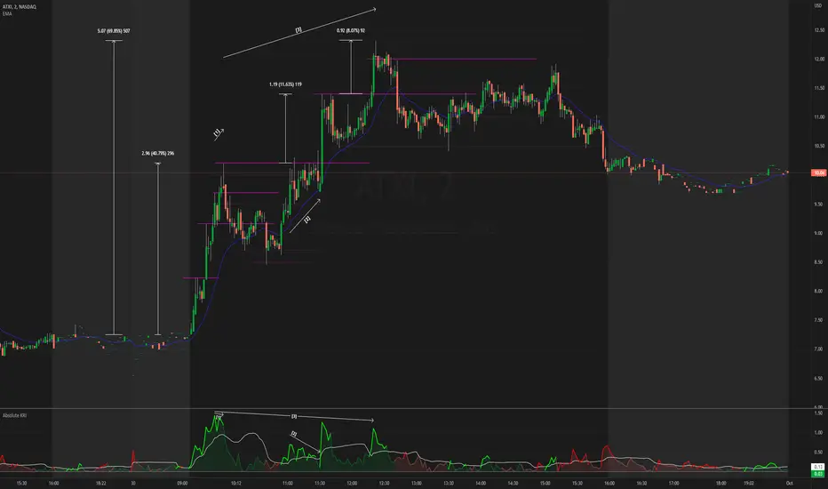
Absolute KRI [vnhilton]The Kairi Relative Index (KRI) is a volatility momentum oscillator that plots the distance of price away from a moving average. An increase or decrease in distance is a sign of increasing/decreasing momentum respectively, & a relatively stable distance would mean momentum is also stable. An increase in momentum is a sign of strength, price extending away from the moving average, & has to revert back to the mean sooner than later, which is why some traders look to take profit or contrarian trades with this increase in momentum.
This indicator plots the KRI in absolute values, meaning that the value can never be lower than 0, helping to see momentum clearer, with colours to still give information on whether or price is in an uptrend or downtrend if it's above/below the moving average respectively. This indicator also includes a standard deviation band, to help spot abnormal distances between price & the moving average, which may be more worthy of attention as that's a sign of significant activity that's caused momentum.
The chart snapshot image above shows ATXI moving ~70% from its open on 30/09/22. From open to midday, we can see price extend away from the 21 EMA (impulses) several times, with retracements back towards the EMA following right after. Let's look at 3 main examples of price creating new highs.
- At (1), price attempts to make a new high, & but meets historical resistance, causing price to retrace back to the mean. On the indicator, you can see momentum failing to be higher than previous momentum after making new highs, which shows that historical resistance, alongside the whole $10 dollar level, were significant in causing a reversal (you can see sell volume using the periodic volume profile (pvp) for each bar). The indicator also shows momentum extending further than the standard deviation band, which is mostly expected as it's right at the open & the stock was in play at the time. The indicator falls back under the standard deviation band which confirms the retracement, as it's showing slowing of momentum.
- At (2), the indicator indicates significant activity again after exiting the standard deviation band, with the impulse slowing down right the resistance, testing it several times to satisfy passive sellers, until aggressive buyers were able to push the price higher. This confirmed new high that followed afterwards didn't exhibit the same momentum as (1), which means that the overall trend is slowing down, meaning that traders should be more cautious of trying to buy into new highs (i.e. take profit earlier, & look for reversals).
- At (3), the indicator shows significant activity again as price heads towards making a new high. As new highs were created, we can see that the momentum causing this breakout is lower than the previous momentum at (2) & (1), again showing that the overall trend is slowing down. The whole $12 dollar level, & FOMO/greed buyers being trapped at the wick (you can see buy volume using the pvp indicator), allowed for short-term resistance for a mean reversion play.
Money Flow Trend Strength [CraftyChaos]I devised this indicator because I wanted to find a way to track the Money Flow Trend to exhaustion for both directions.
Overview:
I use two MFI series and an EMA of the faster MFI series to derive when the Money Flow is trending in one direction or another.
What does this indicator not do:
This indicator does not give buy and sell signals.
What does this indicator do:
This indicator offers confluence with your other indicators to determine when a reversal is approaching after a sustained trend of money flowing in or out of an asset.
This indicator can help time your trades near reversal points, so you are not entering trades in the middle of some trending move.
How to Tune
I would not recommend changing the settings. I have exposed them for people that want to experiment. The short lengths are key to reducing lag
How to read the indicator:
When a red cross appears at the top, this indicates money flow into the asset is strong. Do not short an asset while there are red crosses. You will get REKT
When a green cross appears at the bottom, this indicates money flow exiting the asset is strong. DO NOT buy an asset while there are green crosses. You will get REKT.
When the white step line enters the top, but no crosses appear, this indicates money is flowing into the asset, but is weak. The trend will either gain strength soon or will collapse.
When the white step line enters the bottom, but no crosses appear, this indicates money is flowing out of the asset, but is weak. The trend will either gain strength soon or will collapse.
The green line is the slower MFI. I would not use any crosses with the white step line and the green line. These two lines can cross frequently and show divergences with price. very frequent crossing may indicate sideways movement with no real price movement.
I often see the white step line enter the bottom and top zones under two primary conditions:
Secondary tests of support and resistance zone which fail
Failed breakouts/pullbacks after a pump or dump
Additionally, I use my indicator with the following indicators. You may find them useful:
Jurik Filtered, Composite Fractal Behavior (CFB) Channels (on current timeframe). Note: I often find strong trends trace the upper/lower bands, and end when the upper or lower band flattens
Jurik Filtered, Composite Fractal Behavior (CFB) Channels (on smaller timeframe, i.e., 2hr on a 4h or 15m on the 1hr). Note: I often find weak trend pullbacks/breakouts touch the channel bands
Session Volume Profile. Note: find trend completion corresponds to price above/below VAL areas
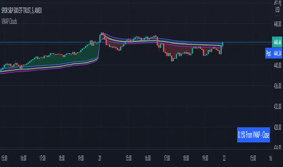
VWAP From Multiple Sources With Cloud & Percentage GapVWAP CLOUD FROM CLOSE, OPEN, HIGH & LOW SOURCES WITH CLOUD & PERCENTAGE GAP
VWAP stands for volume weighted average price and shows the average price of buys/sells based on volume traded across the current session. This VWAP is based off of the Daily session.
***HOW TO USE***
Use the purple cloud between the VWAPs as your entry points as price will typically bounce from that cloud area.
The Yellow Line is the VWAP using the close price as a source.
The Green Line is the VWAP using the open price as a source.
The Blue Line is the VWAP using the high price as a source.
The Purple Line is the VWAP using the low price as a source.
When price is above the VWAP cloud, the background will paint green because the trend is bullish.
When price is below the VWAP cloud, the background will paint red because the trend is bearish.
In the bottom right hand corner, three is a table that will show you the current percentage gap between current price and the VWAP using close as the source.
All sources and colors can be easily switched in the settings menu.
***MARKETS***
This indicator can be used as a signal on all markets, including stocks, crypto, futures and forex.
***TIMEFRAMES***
This vwap indicator can be used on all timeframes but is calculated using the daily session.
***TIPS***
Try using numerous indicators of ours on your chart so you can instantly see the bullish or bearish trend of multiple indicators in real time without having to analyze the data. Some of our favorites are our Auto Fibonacci, Volume Profile, Directional Movement Index, Momentum, Auto Support And Resistance and Money Flow Index in combination with this VWAP Cloud. The other indicators all have real time Bullish and Bearish labels as well so you can immediately understand each indicator's trend.
ToTitans : Buy/Sell HHVWhat is it
It is a volume profile indicator base on y axis. It will show you when the buy/sell volume dominate the market
Differentiation
No one has done this before to calculate buy/sell volume indicator in this fashion
This indicator has been used in AJ Jim class for "Type 2" approach
Suitable for
Intra Day Trading (20m-2h)
TFEX:S501!
"PM me to obtain access"

EulerMethod: V-ProfileVolume profile
50 rows | 50 рядов
Depth — Depth of history | Глубина истории
Range ± — Floating range | Плавающий диапазон
∟ % — Floating range % | Плавающий диапазон %
Amp — Amplitude of histogram | Амплитуда гистограммы
Minimum right margin: 10 bars | Минимальное правое поле: 10 баров

Moving Candle VolumeShows which part of the candle was executed with the highest volume.
Different from Candle Volume Profile because more useful for indicators and scripts
VERY IMPORTANT TO CHANGE THE SETTING BASED ON THE TIMEFRAME.
Does not work on any timeframe lower than 20 minutes

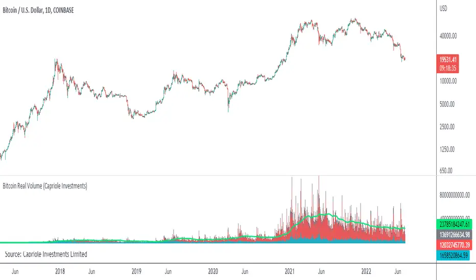
Bitcoin Real VolumeBitcoin’s Real Volume
An accurate read on the change in Bitcoin’s volume profile over time.
Based on 2019 reports by Bitwise and Alameda Research.
Please see the script code notes for assumptions and details on data selection.
Follow me for more information on this script.
Baseline-C [ID: AC-P]The "AC-P" version of jiehonglim's NNFX Baseline script is my personal customized version of the NNFX Baseline concept as part of the NNFX Algorithm stack/structure for 1D Trend Trading for Forex. Everget's JMA implementation is used for the baseline smoothing method, with optional ATR bands at 1.0x and 1.5x from the baseline.
NNFX = No Nonsense Forex
Baseline = Component of the NNFX Algorithm that consists of a single moving average
Baseline ---> Meant to be used in conjunction with ATR/C1/C2/Vol Indicator/Exit Indicator as per NNFX Algorithm setup/structure. C1 is 1st Confirmation Indicator, C2 is 2nd Confirmation Indicator.
JMA (Jurik Moving Average) is used for the baseline and slow baseline.
A slow baseline option is included, but disabled by default.
The faint orange/purple lines are 1.0x/1.5x ATR from the Baseline, and are what I use as potential TP/SL targets or to evaluate when to stay out of a trade (chop/missed entry/exit/other/ATR breach), depending on the trade setup (in conjunction with C1/C2/Vol Indicator/Exit Indicator)
This script is heavily based upon jiehonglim's NNFX Baseline script for signaling, barcoloring, and ATR.
SSL Channel option included but disabled by default (Erwinbeckers SSL component)
POC (Point of Control) from Volume Profile is included/enabled by default for both the current timeframe and 12HR timeframe
03.freeman's InfoPanel Divergence Indicator was used a reference to replace the current/previous ATR information infopanel/info draw from jiehonglim's script. I'm not sure whether I like the previous way ATR info was displayed vs how I have it currently, but it's something that is completely optional:
Specifically: I am tuning this baseline/indicator for 1D trading as part of the NNFX system, for Forex.
DO NOT USE THIS INDICATOR WITHOUT PROPER TUNING/ADJUSTMENT for your timeframe and asset class.
Note about lack of alerts:
Alerts for baseline crosses (and other crosses) have been purposefully omitted for this version upon initial publication. While getting alerts for baseline crosses under certain conditions/filtered conditions that eliminate low-importance signals and crossover whipsaw would be great, it's something I'm still looking into.
SPECIFICALLY: There are entry, exit, take profit, and continuation signal components in relation to the Baseline to the rest of the NNFX Algorithm stack (ATR/C1/C2/Vol Indicator/Exit Indicator), including but limited to the "1 candle rule" and the "7 candle rule" as per NNFX.
Implementing alerts that are significant that also factor in these rules while reducing alert spam/false signals would be ideal, but it's also the HTF/Daily chart - visually, entry/exit/continuation signal alignment is easy to spot when trading 1D - alerts may be redundant/a pursuit in diminishing returns (for now).
//-------------------------------------------------------------------
// Acknowledgements/Reference:
// jiehonglim, NNFX Baseline Script - Moving Averages
//
// Fractured, Many Moving Averages
//
// everget, Jurik Moving Average/JMA
//
// 03.freeman, InfoPanel Divergence Indicator
//
// Ggqmna Volume stops
//
// Libertus RSI Divs
//
// ChrisMoody, CM_Price-Action-Bars-Price Patterns That Work
//
// Erwinbeckers SSL Channel
//

Bonfire vs Algo Profile by CaptBlackBeard
Top Secret: Using reactive Bonfire math vs Volume Profile to show gaps in the Profit Algorithm guiding the price to balance the books. This is valued data

Absorption Pro V4This indicator detects absorption-style reversal setups and scores them with a multi-factor model.
It builds key levels from ZigZag/Fibonacci and round numbers across multiple timeframes, then flags potential absorption candles using volume and a delta-proxy filter plus strict candle-structure rules. Signals are validated with trend context (MA/SMMA/EMA/ATR), VWAP positioning, and optional momentum/volatility filters (RSI, Stoch, CCI, MACD, ADX, Volume Profile). Only score-threshold crosses can trigger long/short markers and alerts (defaults tuned for NQ).

SMM FRVPMarks previous day, week, and month Fixed Range Volume Profile (FRVP) levels on the chart, including POC, VAH, and VAL. These levels help identify prior value areas, key support and resistance zones, and market acceptance or rejection based on volume

RokTrades's Info Table LITERokTrade’s Info Table — LITE is the free “quick context” version of my PRO table.
I built this for intraday traders who want the important market internals and key levels in one clean panel, without turning the chart into a mess. This version is intentionally trimmed: no scoring engine, no ORB module, no trap logic, and no chart plotting — just the core info I check every session.
WHAT LITE INCLUDES
INTERNALS (LIVE)
VIX: value + 1-bar change, plus optional “since open” delta in the hint column
Put/Call (P/C): includes a moving average and a simple regime tag (P/C above MA = risk-off, below = risk-on)
ADD: advance/decline with change + optional since-open delta
NYSE U/D and NASDAQ U/D: signed up/down volume ratio
Optional toggles: TRIN and TICK (if you want them)
SIMPLE “STATE TAGS” (NO SCORING)
This is not a bias/score engine, but it does give quick context:
VIX Regime: VIX vs EMA
P/C Regime: P/C vs MA
Breadth Bias: simple majority read using available breadth signals so you can see if internals are leaning bullish, bearish, or mixed
KEY LEVELS (TABLE ONLY)
Premarket High / Low (PMH / PML)
Prior Day High / Low (PDH / PDL)
Prior Day Close (YClose)
Prior Day Mid (PD Mid)
UI / USABILITY
Compact vs Expanded table mode
Mobile-friendly short labels option
Table position + text size controls
Optional “update only on last bar” for performance
NOTES
Premarket High/Low requires Extended Hours candles enabled.
If you don’t see certain internals on your symbol/exchange, that’s usually a data feed/symbol mapping limitation (TradingView varies by broker/feed).
WHAT THE PRO VERSION ADDS (TEASER)
PRO is where the “decision layer” lives:
Bias scoring engine
OPEN bias vs INT bias + alignment / divergence read
ORB 15/30/60 status
Trap warning system + play hints (when breakouts/breakdowns are suspect)
Prior Day Volume Profile levels (YPOC + Value Area)
Plot up to 10 key levels on the chart with labels + styling options

Super Regression Trend█ OVERVIEW
Super Regression Trend is an advanced trend-following indicator that combines classic linear regression with a SuperTrend mechanism based on RMSE (Root Mean Square Error). Instead of traditional ATR, it uses price deviations from the regression line, allowing for highly precise adaptation to current market volatility. The indicator is clean, dynamic, and equipped with optional risk management tools — automatic Take Profit and Stop Loss levels displayed after each trend reversal signal. Perfect for traders seeking solid trend confirmation with built-in position management support.
█ CONCEPT
The indicator was created to combine the advantages of linear regression (smooth trend tracking) with the reliability of the SuperTrend mechanism (trailing stop).
The key element is calculating RMSE based on deviations of the source price from the regression line over a specified period. The band around the regression (RMSE × multiplier) creates dynamic, trailing upper and lower levels. The trend changes only after price closes beyond this band — this allows the indicator to react quickly to new impulses while effectively filtering noise and false breakouts in consolidation.
█ FEATURES
Data source:
- Source price (default: close)
- Regression Length
Calculations:
- Linear regression line (ta.linreg)
- RMSE of deviations within the length window
- Upper and lower bands: regression ± (RMSE × Multiplier)
Trailing mechanism:
Levels are “pulled” in the direction opposite to the trend (minimized/maximized)
Trend change logic:
- Down → Up: close > upper band
- Up → Down: close < lower band
Visualization:
- SuperTrend line with breaks at reversal points
- Optional gradient fill between SuperTrend line and regression
- Optional bar coloring based on current trend
- “Buy” labels (green upward arrow) and “Sell” labels (red downward arrow) only on confirmed trend changes
Risk management:
- Optional automatic TP1/TP2/TP3 and SL levels after each signal
Two calculation modes:
- Candle Multiplier – multiplier of average candle body size (SMA(|open–close|))
- Percentage – percentage of the signal close price
Levels drawn as short horizontal lines
Persistent table in the top-right corner with current TP/SL values
Alerts:
- Buy Signal – triggers only on confirmed uptrend change
- Sell Signal – triggers only on confirmed downtrend change
█ HOW TO USE
Add to chart → paste the code in Pine Editor or search for “Super Regression Trend”.
Main settings:
- Regression Length → default 20 (regression window length)
- RMSE Multiplier → default 2 (key sensitivity parameter)
- Show SuperTrend Line / Fill to Regression / Color Bars → visual options
- Show TP/SL Levels → enable/disable risk management tools
- TP/SL Calculation Mode → “Candle Multiplier” or “Percentage”
- Multipliers/percentages for TP1–TP3 and SL → fully customizable
Interpretation:
- Green line and shading = uptrend
- Red line and shading = downtrend
- Higher RMSE Multiplier = fewer signals, higher quality
- Lower Multiplier = faster reaction, more signals (aggressive mode)
█ APPLICATIONS
Excellent for:
- Classic trend-following (enter with trend, exit on reversal)
- Momentum and breakout strategies
- Automated position management with optional TP/SL levels
Best combined with:
- Support/resistance levels, Pivot Points, psychological round numbers
- Confirmation from oscillators (RSI, Stochastic, MACD)
- Volume or volume profile analysis
Style adaptation:
- Scalping / daytrading → shorter regression length (10–20) and lower Multiplier (1.5–2.0)
- Swing / longer-term positions → longer regression (30–50) and higher Multiplier (2.0–3.0)
█ NOTES
- Works on all markets and timeframes
- Effectiveness depends on matching the RMSE Multiplier to the instrument’s volatility
- Higher Multiplier and Length values = fewer, but significantly more reliable signals

Trade Confidence BoosterNOT FINANCIAL ADVICE. TRADE AT YOUR OWN RISK.
The Smart Day Trader’s and Scalpers Secret Weapon
Stop guessing. Start trading with confidence .
The Trade Confidence Booster is a comprehensive trading system that transforms chaotic price action into crystal-clear entry and exit signals. Built for day traders and scalpers who demand a clean, rule-based indicator with structure, clarity, and consistency — without clutter. This indicator combines institutional-level analysis with simple, actionable signals.
What Makes This Different?
While others chase random breakouts and get stopped out repeatedly, Trade Confidence Booster waits for the market to show its hand through the coveted "Confidence Candle" pattern - a powerful consolidation signal that appears within clear trends and explosive moves. This isn't another repainted indicator making false promises. It's a complete trading framework that shows you:
WHEN to enter (Confidence Candles + Entry Signals)
Also, WHEN to trim and lock in gains (3 Customizable Trim Tiers)
WHERE to exit (Dynamic and Customizable Trend Break Triggers)
HOW MUCH confidence to put into the trade (Confluence Scoring System)
Key Features
📊 Smart Trend Detection - Multi-layered trend analysis combining price structure, momentum, and volume that also has the ability to AVOID CHOP
💪 Confidence Candle Technology - Identifies low-risk, high-probability entry zones
🎯 7-Point Confluence System - Never guess if a setup is worth taking
📈 Clear Entry Signals - CALL/PUT labels complete with quality scores
💰 Automated Profit Management - Built-in trim levels with default settings at 0.35%, 0.80%, and 1.25% that are completely customizable
🛡️ Adaptive Trailing Stops - Protects profits while letting winners run with adjustable buffers that compliment your trading and risk style
📍 Multi-Timeframe Support Levels - Hourly S/R zones visible on any timeframe
📐 Dynamic Fibonacci Levels - Auto-adjusting to current trend
🔵 Opening Range Breakout (ORB) - Visually see three (3) days of Original Ranges based on your desired timeframe (default set at 15 minutes) and easily identify a breakout in either direction
📊 Volume Profile with POC - See where smart money is positioned
This indicator isn’t built try and predict the market — it’s designed to help you stay aligned with structure, avoid chop, and manage trades with discipline.

Master Crypto Overlay [R2D2]The Gemini Master Crypto Overlay: User Guide
1. Introduction
The Gemini Master Crypto Overlay is a professional-grade TradingView script designed to consolidate six powerful institutional indicators into a single, clean "heads-up display" (HUD).
Instead of cluttering your chart with multiple sub-windows (which shrinks your view of the price), this script uses smart overlays and a data dashboard to provide actionable data instantly. It is optimized for the Daily timeframe as requested, but functions on all timeframes.
Included Indicators:
Ichimoku Cloud: Identifies the primary trend and support/resistance zones.
MACD (Custom Crypto Settings): Optimized (3-10-16) for catching fast crypto moves.
WaveTrend Oscillator: Visual signals for Overbought/Oversold entries.
Supertrend: A trailing stop-loss line to keep you in profitable trades.
Ultimate RSI (MTF): Multi-timeframe analysis to ensure you are trading with the higher trend.
Volume Reference (VWAP): An on-chart proxy for Volume Profile to spot fair value.
2. Installation Instructions
Step 1: Open Pine Editor
Launch your chart on TradingView.
At the bottom of the screen, click the tab labeled Pine Editor.
Step 2: Paste the Code
Delete any text currently in the editor window.
Copy the code block at the bottom of this response.
Paste it into the editor.
Step 3: Save and Add
Click "Save" (top right of the editor) and name it "Master Crypto Overlay".
Click "Add to chart".
Note: You may hide the "Pine Editor" panel now by clicking the arrow at the bottom center of the screen.
3. How to Use the Interface
The script is designed to be intuitive. Here is what you are looking at:
A. The Dashboard (Bottom Right)
This is your "Confluence Checker." It summarizes the status of the major indicators in real-time.
GREEN: Bullish (Buy/Hold)
RED: Bearish (Sell/Short)
GRAY: Neutral/Choppy (Stay out)
Pro Tip: Do not enter a trade unless at least 3 out of 4 signals on the dashboard match your direction.
B. On-Chart Signals
Clouds (Red/Green): If the cloud is Green and rising, only look for Long trades. If Red, only look for Short trades.
Supertrend Line: This continuous line trails the price. If price is above it (Green line), you are safe. If price closes below it, the trend has reversed.
MACD Labels: Small "MACD" text appears when momentum flips.
WaveTrend Circles:
Blue Circle (Bottom): Price is "Oversold." Good time to buy if the trend is up.
Orange Circle (Top): Price is "Overbought." Good time to take profit.
4. Strategy: Maximizing Trading Returns
To make money with this script, you need a rule-based system. Do not just blindly click when you see a label. Use this "Trend & Trigger" strategy:
The "Golden Entry" (High Probability Long)
Trend Check: Ensure price is ABOVE the Ichimoku Cloud.
Dashboard Check: Verify the RSI Status says "BULL (>50)".
The Trigger: Wait for a pullback where price touches the Supertrend Line (Green) or the top of the Cloud.
The Entry: Enter the trade when a Blue WaveTrend Circle appears OR a MACD Buy Label prints.
Stop Loss: Place your stop loss slightly below the Supertrend line.
The "Exit Strategy" (Protecting Profits)
Conservative: Sell half your position when an Orange WaveTrend Circle appears.
Trend Follower: Hold the rest of your position until the Supertrend Line turns RED.

Interest ZonesThis indicator automatically identifies and plots "Interest Zones" around significant pivot highs and lows, representing potential areas of institutional interest, support/resistance, or accumulation/distribution. Zones are dynamically merged when pivots cluster near the same price level and extended for visibility.
How It Works (Technical Methodology)
Pivot Point Detection
The indicator uses Pine Script's ta.pivothigh() and ta.pivotlow() with asymmetric left/right lengths (default left=20, right=13) to detect swing highs and lows. This allows for customizable sensitivity – longer left for stronger confirmation, shorter right for faster detection.
Zone Start Condition (Filtering)
Multiple modes control from which point in history zones begin to be drawn:
"None": All historical pivots (limited by max zones).
"Auto (Start of Day)": Zones only from the beginning of the current trading day (resets daily).
"Manual Date": User-defined fixed date.
"Interactive (Chart)": User-confirmed date via input (useful for backtesting specific periods).
"Last X Bars": Only pivots within the last user-defined number of bars (default 400).
A vertical line marks the start point in date-based modes for visual reference.
Zone Construction
For each valid pivot:
Zone thickness is based on ATR(14) × user-defined multiplier (default 0.3) for dynamic, volatility-adjusted height.
Pivot High zones: Centered below the high (potential supply/resistance).
Pivot Low zones: Centered above the low (potential demand/support).
Zones are drawn as boxes extending to the right, with gray fill and border.
Merge & Overlap Logic
When a new pivot falls inside an existing zone or is very close (within user-defined "Proximity Sensitivity %" of the zone's midpoint, default 1.1%):
The new pivot is merged into the existing zone.
A counter ("x2", "x3", etc.) is displayed on the zone, indicating how many pivots have clustered there.
The zone is strengthened visually (counter text) and extended further right.
This highlights high-interest levels where price repeatedly reversed.
Zone Management
In "None" mode: Only the most recent user-defined max zones are kept (default 5) – oldest deleted automatically.
In other modes: Up to ~490 zones (performance limit), oldest pruned if exceeded.
All zones auto-extend to the right on the last bar for continuous visibility.
Visual Elements
Uniform gray color for all zones (configurable).
Transparent background fill (adjustable).
Counter text in white (configurable) when zones have multiple touches.
Clean, non-directional design – focuses purely on clustered reversal points.
How to Use
Interest Zones highlight price levels where the market has shown repeated respect through multiple swing pivots – often coinciding with institutional order clusters, psychological levels, or hidden support/resistance.
Higher counter values ("x3+", "x5+"): Stronger zones – higher probability of reaction on retest.
Use for:
Potential reversal or bounce areas when price approaches a zone.
Confluence with other tools (order blocks, FVG, volume profile, etc.).
Stop-loss placement beyond zones or take-profit at opposite zones.
Daily reset ("Auto Start of Day"): Ideal for intraday trading – fresh zones each session.
Backtesting: Use "Manual" or "Interactive" date modes to analyze specific historical periods.
"Last X Bars": Good for medium-term swing analysis without full history clutter.
Adjust ATR multiplier for tighter (lower) or wider (higher) zones based on asset volatility. Increase proximity sensitivity for more aggressive merging in ranging markets.
Combine with trend direction, volume, or higher-timeframe structure for best results.
Disclaimer
This indicator is a technical analysis tool and should be used in conjunction with other forms of analysis. Past performance does not guarantee future results. Always use proper risk management.

ORB + FVG A+ PRO (All-in-One) [QQQ]Configurable ORB + FVG + filters (VIX, ORB range, relative volume) + A+ PRO (retest at the FVG edge + rejection) + anti-fakeout + orange reminder “CONFIRM POC/HVN (Volume Profile)” right when the A+ signal appears

Tesseract X-RayTesseract X-Ray — Smart Money Concept indicator that reveals hidden market structure.
Features:
• Fair Value Gaps (FVG) — imbalance zones where price tends to return
• Order Blocks (OB) — institutional supply/demand zones
• Volume Profile — POC, VAH, VAL levels
• High Volume Nodes (HVN) — liquidity clusters
Clean visualization with automatic zone detection and mitigation tracking.
Built-in alerts for key level touches.
by @TesseractCrypto

BTC Runner V1Bitcoin Runner V1 — advanced proprietary visual tool created specifically for long-term Bitcoin cycle research on 1D, 1W and 1M timeframes.
The indicator operates in two fundamentally different visual modes:
Buffett Mode (4-Year Halving Cycle Logic)
Fully built on Bitcoin’s historical ~4-year halving cycle. Using an original mathematical formula and real-time price data, the indicator continuously tracks whether the current cycle has reached the structural point that historically marked the final phase of previous bull markets.
As soon as ALL formula conditions are met for the first time:
- Chart background instantly changes color (green → red at cycle top, red → green at cycle bottom reversal)
- A large permanent non-repainting banner appears showing the exact date and price of the All-Time High (ATH) of the current cycle
- Fixed label “ATH” with price and timestamp is plotted and remains on the chart forever
Examples on charts:
- Chart #1 (20 Jan 2018) — green background still active, bull phase ongoing
- Chart #2 (22 Jan 2018) — exact moment all conditions triggered: background turns red + permanent ATH banner with unchangeable data appears
The same logic works in reverse when a bear cycle ends and a new bull cycle begins.
Cramer Mode (Historical Correction & Drawdown Zones Logic)
Based on over 10 years of personal observation of recurring percentage zones across multiple Bitcoin cycles:
• Major corrections historically reaching up to ~84% from local highs
• Intermediate drawdowns typically 20–55%
When ALL conditions of the multi-stage proprietary formula are satisfied for the first time after a prolonged decline or consolidation, the indicator automatically draws in real time:
1. Large green background banner with bold white text “AP” (Analyzed Point) — marking the price level where, according to many years of observation across several cycles, such deep corrections have historically completed.
2. Dynamic floating label “TP” (Tracked Progress) — a temporary price marker that moves with the current price in real time.
As soon as price touches or exceeds this level, the entire banner instantly and permanently turns blue and the text changes to “AP Completed”.
All banners, colors, and labels appear strictly automatically in live mode and never repaint.
Important:
- The script contains over 500 lines of completely original closed-source code.
- No standard indicators are used (moving averages, Fibonacci, waves, volume, volume profile, etc.). Only pure original mathematical modeling.
- The indicator is intended exclusively for research, educational, and informational purposes.
- It contains no trading recommendations, investment advice, or calls to action of any kind.
Respectful note to TradingView moderators and users:
If any visual elements or logic seem similar to previously published open-source scripts — feel free to use those open-source versions instead.
Bitcoin Runner V1 is a 100% original closed-source tool based on the author’s personal multi-year research and observations.
